Painting the view of Warm Springs, VA
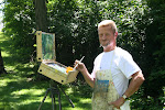
Among the more amusing and enjoyable aspects of painting outdoors are the conversations that happen when someone stops to observe what I am doing, ask questions, and offer information about themselves. Those chats give me insight into general perceptions about art, common responses to my paintings, and views into the lives of people who travel a completely different paths through life.
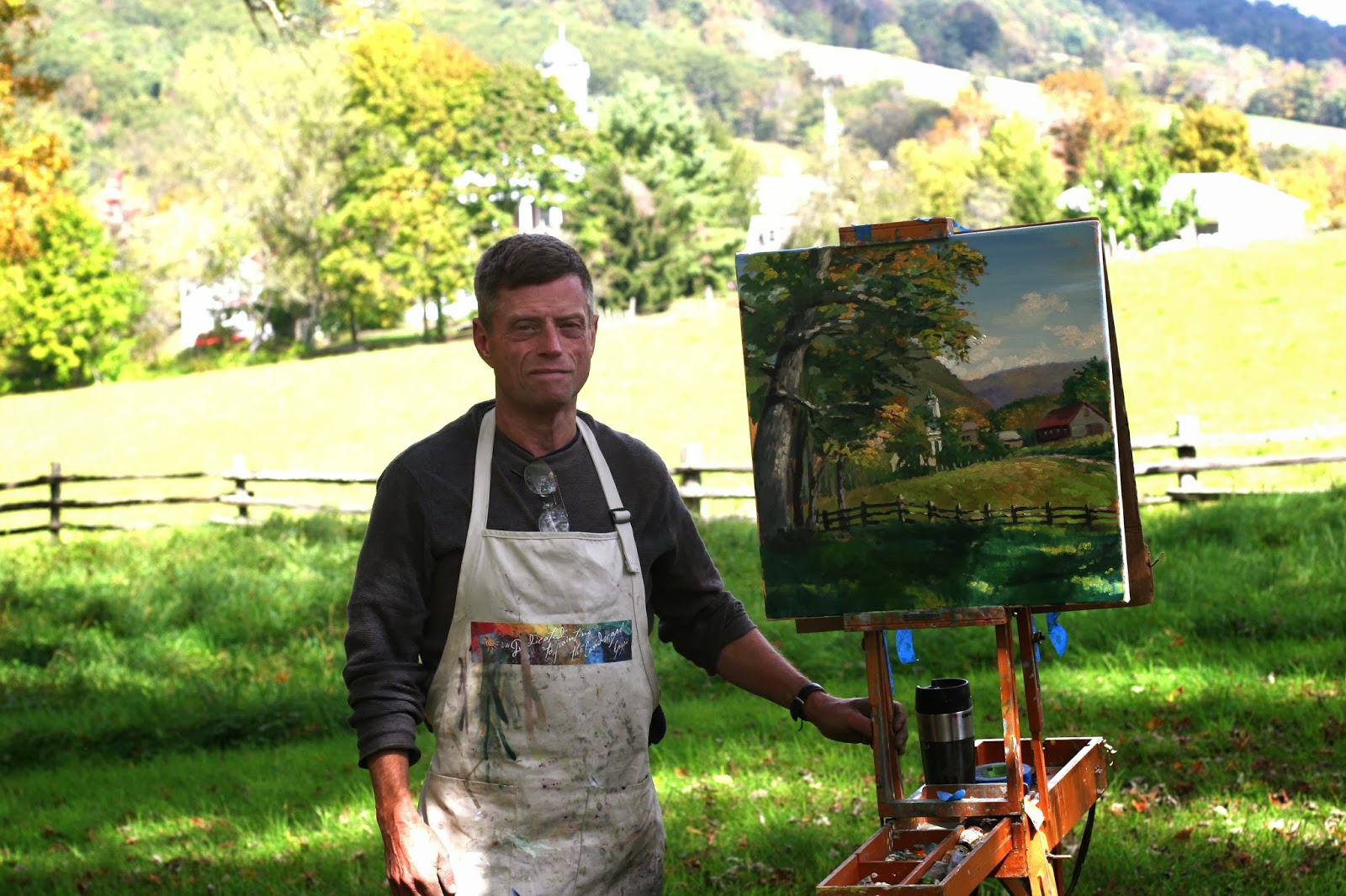
Perhaps one of the most enjoyable conversations took place while I was participating in the First Annual Bath County Plein Air Festival in October, 2013. I parked in a clearing along a state highway to paint the view of a cow farm, river, and distant mountains. After setting up my easel, the owner of the farm came to take care of a new calf and to chat with me. His only comment about my painting was that I recorded only one of the three peaks in the distant mountains. He watched as I corrected that grave omission.

Bath County Cattle Farm
The farmer was very proud of the fact that an artist found his land to be beautiful. After all, this was where he was raised, where his children grew up, and where he had worked every day of his life since he was a young boy. He wanted me to understand the challenges of maintaining a beautiful farm like his, from managing the land to raising the cattle. After the hour of chatting, I learned the names of every mountains, stream, and farm within my view; I was given two methods for curing diarrhea in cattle; and I learned about the market reports, livestock auctions, and Hee Haw programs broadcast over RFD-TV cable network. He didn't say much about my painting, but I think he learned something about my world from watching the picture take shape.
There were other aspects of this plein air event I didn't enjoy -- the competition to paint salable and award-winning paintings, the long days of painting and socializing, the anxiety during the opening night sale and awards presentation. For example, it bothered me when I was told the only collectors who would be interested in my painting of the local Presbyterian church would be members of that congregation. Nevertheless, I really appreciated the chance to talk with the other participating artists and the folks who stopped to ask questions and offer a glimpse into their lives. If I am invited back next year, those are the things I will look forward to.

Warm Springs Prebyterian Church


